फीचर
Acrylic Still Life Painting Tutorial: Terracotta Plant Pots
Mastering still life requires more than just technical skill; it requires a clear mental vision and a systematic approach. As Claude Monet once said, "No one is an artist unless he carries his picture in his head before painting it, and is sure of his method and composition." In this guide, we will explore how to take inspiration from everyday household items—like a collection of sun-drenched plant pots—and transform them into a vibrant, professional painting.
Matthew Daniel Whitaker
संपादकीय डेस्क
संपादक की टिप्पणी
पूरा लेख नीचे जारी है।
सेक्शन
समाज और ट्रेंड
Mastering still life requires more than just technical skill; it requires a clear mental vision and a systematic approach. As Claude Monet once said, "No one is an artist unless he carries his picture in his head before painting it, and is sure of his method and composition." In this guide, we will explore how to take inspiration from everyday household items—like a collection of sun-drenched plant pots—and transform them into a vibrant, professional painting.
The common tendency for beginners is to start painting immediately and solve problems as they arise. However, without a strategic plan, you often face frustration with color mixing and inaccurate drawing. This tutorial provides an easier way by walking you through the thought process of color composition, choosing a ground color, and building the piece layer by layer before the brush even touches the canvas.
Unraveling Your Subject and Composition
The inspiration for this piece comes from a cottage garden, specifically the intense orange of terracotta contrasted against the muted purple of old red bricks and the fresh greens of spring leaves. When analyzing a scene, it is helpful to squint your eyes to see the "value pattern"—the arrangement of lights and darks. In the original view, the pots on the right side blended too much into the background. By cropping and reframing the subject, we focus on the main pot, creating a simpler yet more powerful composition with interesting negative spaces.
To ensure the best result, it is essential to "reverse engineer" the subject. For this specific scene, there are three primary challenges to address: achieving an accurate drawing of the pot's ellipses, keeping the background colors muted so they don't compete with the main subject, and judging the greens of the leaves so they remain balanced.
Strategic Color Composition
The success of a painting often depends on the "ground," or the initial layer of color applied to the canvas. By choosing a pigment that matches the dominant muted tones of the background—in this case, a yellow-gray similar to the mortar between bricks—you give yourself a significant head start. If the ground color is accurate, you can quickly mix the remaining colors for the brickwork and the pots using a limited palette of muted pigments like Venetian Red and Violet Iron Oxide.
When it's time to paint the leaves, the goal is to avoid greens that are too garish. A mixture of Raw Umber and Cadmium Yellow Light creates a perfect, natural-looking muted green for the shadow areas. You can then gradually introduce Ultramarine Blue and Titanium White to "creep up" on the more vivid greens without overpowering the rest of the composition. Remember: yellow warms the green, while white cools it.
Materials and Step-by-Step Execution
To follow this tutorial, you will need a 10 oz cotton duck canvas (8 x 10 inches), a selection of synthetic brushes (small round, small flat, and filbert), and a palette knife for mixing. For the drawing phase, a mechanical pencil and a Burnt Umber acrylic marker are ideal for establishing crisp contours and dark value patterns.
The Color Palette:
-
Primaries & Highlights: Titanium White, Cadmium Yellow Light, Ultramarine Blue
-
Earthy & Muted Tones: Burnt Umber, Raw Umber, Burnt Sienna, Venetian Red, Violet Iron Oxide
Begin by preparing the ground with a mix of Neutral Gray and Yellow Iron Oxide, diluted with a few drops of airbrush medium to maintain the paint's integrity. Once the ground is dry, sketch the subject using a mechanical pencil, focusing on the ellipses of the pots. Refine the drawing by erasing construction lines and reinforcing the deepest shadows with the acrylic marker.
Finalizing the Still Life
After the drawing is set, block in the background shadows using a mix of Burnt Umber and Ultramarine Blue. Move to the brickwork using Violet Iron Oxide, allowing the ground color to show through as the mortar. Next, apply the Venetian Red for the terracotta pots, adding yellow and white to the areas where the light hits.
Finally, layer in the greens of the foliage. Take a step back frequently to observe the piece as a whole. At this stage, shifting your focus back to your "drawing brain" allows you to look for shapes and shadows rather than just color changes. These small tweaks in the final moments often make the most significant difference in the overall feel of the painting, resulting in a piece that captures both the light and the mood of the scene.
संबंधित कहानियाँ
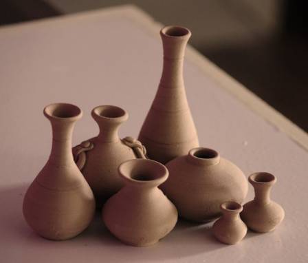
Ceramic Creators: Modern Methods and Creative Visions
Clay has served as a cornerstone of artistic creation for millennia, acting as a bridge between ancient utility and modern sculpture.
और पढ़ें »
शेर
सवाना में खड़ा, यह शेर गर्व से अपने राज्य का जायजा लेता है
और पढ़ें »
स्मार्ट चश्मे बनाम एआई चश्मे
AI-संचालित चश्मे के साथ सिर्फ़ स्पष्ट दृष्टि से कहीं अधिक का अनुभव करें। भीड़भाड़ वाली सड़कों पर रास्ता खोजें, वास्तविक समय में पलों को कैद करें, या अपने फ़ोन तक पहुँचे बिना सूचनाएँ प्राप्त करें।
और पढ़ें »
6 Reasons Why Football Is The Most Popular Sport In The World
Football is undeniably one of the biggest sports in the world, with an estimated 3.5 billion fans worldwide—that’s nearly half of the global population.
और पढ़ें »
यह आधिकारिक है: अध्ययन में पाया गया है कि प्यारे जानवरों को देखना आपके स्वास्थ्य के लिए अच्छा है
शायद इसके पीछे कोई अच्छा कारण हो सकता है कि हम छोटे सूअरों और रोयेंदार बत्तखों को ऑनलाइन देखना क्यों पसंद करते हैं।
और पढ़ें »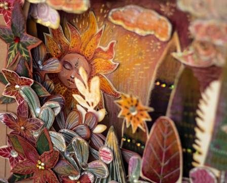
Botanical Realism in Paper
On Instagram, I discovered the exquisite floral paper creations of Marlene from Denmark, and I was instantly captivated. What strikes me most about her work is how she embraces every phase of a plant’s life, from budding flowers to wilted petals and autumnal browning leaves. Marlene’s goal is always to craft botanically accurate representations.
और पढ़ें »